Reflection 9/7-9/11

This week in class we looked at a few different digital humanities projects. On Tuesday I chose to look at a site about the Salem Witch Trails because that period in history has always really interested me. I thought it was really cool how the project focused on the voices of the women because that’s not a side of history we get to see a lot. In highschool, I wrote a paper about the time period and having this resource with so much information all in one place would’ve been very useful. In addition, the project sort of reminded me of a play I saw a couple years ago in New York which looked at The Crucible in a different light.  

Today in class, we looked at an interesting graph about readers on Goodreads. This was particularly exciting to me because reading is one of my favorite things to do. In addition, I use Goodreads to rate and review books so seeing it in class was unexpected. Personally, I like to read all different genres so I don’t quite know where I would fall on the graph but it was cool to see it all laid out like and also cool that their are people out there that care enough about a site I use to make a whole project based on it. 

In reading through all of the blog posts from last week I really found it cool just how wide of a space digital humanities seems to be. It’s interesting that no matter how niche the topic you’re looking for is you’ll still probably be able to find a project focused on it. Or even if your researching a big topic, you’ll be able to find something so specific by looking through digital humanities projects focused around that topic.    
Week 2

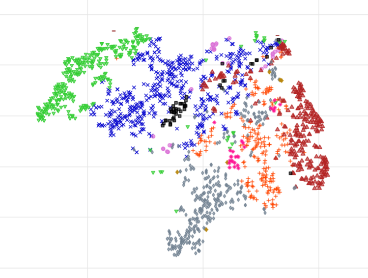
Today in class we looked at an interesting project about books and reading and what books people read the most but also what types of people read numerous types of different genres. The project explains how they got their data by looking at the data of 1750 of the most active readers on the social reading site Goodread. They used 10 different genres and then used the data of the readers to see not only what genre do people read the most but also how people mix their genres of books. They then used a 2D map to show the data because it is able to spread out genres on their own for people who only read one genre and then are able to mix them together when someone on the graph reads multiple genres of books. This 2D graph was cool to me but confusing at first. After getting it explained I understand how it works and it makes this project a lot cooler to me. To see the graph at first I was very confused because there weren’t any numbers on it like a regular graph would have and I didn’t really know what any of it meant. After hearing the explanation for it, it makes sense that it was to show what genre of books are easier to mix with other genres. It helped me understand what the project was even about even after reading the entire thing. Overall, this was a productive week in class and I was able to learn what a 2D graph was and it was cool to continue to look at different digital projects.

Week Three Blog Post

During this week, I was able to further solidify my understanding of what digital humanities are. We had spoken about different definitions in the past, but we hadn’t worked firsthand with any projects, so the term was still a bit ambiguous to me. Now that we have explored certain projects in a deeper way, I can wrap my head around the concept digital humanities.

Meriam Posner’s sources, processed, presented method is useful for me when I navigated the various DH projects we explored this week. While it is not an exhaustive method, it does help me get started with analyzing each project. What was especially interesting to me were the DH projects that required the processing of very old manuscripts and letters. Being able to see the original handwriting of certain important people throughout history and also having the readable text side-by-side is very useful to me as a reader, and also reinforces the human side of the digital processes.

The most interesting website we have visited, in my opinion, is “Readers Mapped”. I am a frequent user of Goodreads, I was very curious to see the data visualized from a website I use often. I could definitely relate to the concept of staying near related genres, especially in reading literature and listening to music. For example, I am a classical musician, and some of my favorite pieces of music are (naturally) classical. I frequently listen to composers like Mozart, Bach, Ravel, Mahler, and Scriabin. You could expect a music listener like me to also listen to jazz, since many jazz musicians were heavily inspired by the great classical composers (Bill Evans was specifically heavily inspired by Ravel). On the other hand, a music listener like myself would be much less likely to listen to modern pop music (Taylor Swift, Sombr, Sabrina Carpenter, Noah Kahan, etc.). This phenomenon is paralleled in the graph on the website “Readers Mapped.” People who are avid romance readers read very little literary fiction, but there is some overlap between the romance readers and the fantasy readers. (This is expected, especially with the huge popularity of the subgenre “romantasy.”)

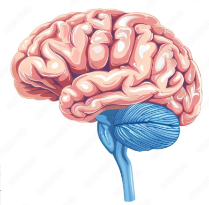
As for one last thing I found interesting, the graph on “Readers Mapped” looks eerily similar to the human brain (see below).

Week 3

This week we talked a lot about different archives, old books and stories, and how old files have been digitized and organized so anyone interested can easily access and sort through different files that they wouldn’t be able to do in the physical world. I think it’s super important for old history and stories to be preserved, and having them digital means they’ll be there forever. This makes learning about the past a lot easier. Instead of having to travel somewhere and look through a bunch of physical books or documents, people can find a lot of this information online. This can also help students and researchers find things that they wouldn’t have found otherwise. It makes information more available to everyone instead of only people with access. Having such an easy access source to these types of things gives people a broader understanding of the world and how the people before us shaped how the world is today. 2000 years ago all people had rock paintings. It just goes to show how far the digital world has come.

One thing I can connect this to is social media, especially TikTok. There are millions of videos being posted every day showing what people are doing, what’s popular, and what’s happening in the world. In a way, social media is creating an archive of our generation without us really thinking about it. Years from now, people can look back at old videos the same way in class we’ve been looking back on old files.

Week 3: My reflection during past 3 weeks

The reflections in the past 3 weeks, regarding to my knowledge with Digital Humanities have expanded so much. From what I’ve gathered, I could see the researches for every projects requires lots of strategic planning on what they’d need to use, such as t-SNE or other kinds of tools. I felt perhaps there might have been some frustrations figuring how to convert them. where to find those informations, then How to process those sources which they’ve gathered together. The planning and forming the team together would require mostly everyone work on same page with their motivations to reach their goal.
This actually parallel with what I’ve been going through the past year. I have acquired my mother’s things in the storage. She passed away 3 years ago. I had to empty and close the storages. I went through things and sorted them out. It was a lot of things, and many pictures that could be around 35,000 to 40,000 dating back to 1900’s. Along with many equipments such as slides, negatives (pictures). Basically many things we have discussed about in class. I also was left with almost 2,000 comic books. I had to sort them out and put them all in each of their genres and seeing how cultures were like back then in the 50’s, 60’s, 70’s and few of 80’s. I had to learn a lot about their values at the time and history behind them and why it was very popular back in the day. So in contrast this class feels like it was perfect for me to be taking this. Perhaps I ll know what to do with all the things I’ve been afforded with. It makes me appreciates for those who have worked hard to bring us this wrath of knowledges to absorb.

week 2 – dynamic dialects

Source(s)

UTI (Ultrasound Tongue Imaging system) takes a series of images at a frame rate of 121 fps that are complied into a video format to show the visual movement of individual’s tongues, lips, and mouth. It involves multiple people from around the world that speak English. Includes video of the ultrasound, people and their biographical information, and audio of their speech pronunciation patterns.

Process

Taking people from all over the world who speak English they hook them up to “a high-speed Sonix RP ultrasound machine was used with automatic audio-ultrasound synchronization, recording at 121 frames per second.” Articulate Assistant Advanced (AAA) software version 2.16.12 was used to record simultaneous audio and UTI. A “short-handled microconvex probe set to an angle of 150°” was attached to a stabilizing headset on participants to record their outer faces simultaneously as well. Video from the UTI is compiled with the facial video and the audio to form one singular playable video and audio format. Words were displayed as text via a screen to the speakers to iterate aloud. Audio was recorded using an “Audio Technica directional clip-on microphone” attached to the side of the headset.

Presentation

They chose to display their findings in 2 different ways. “Accent Map” in the form of a map that allows users to interact with a world map that has the speakers linked to pinpoint dots placed where their accent is from. This links to both the UTI video with integrated face recordings as well as audio from the video. after selecting the dot location there is a list of all words that participants said with the base word being spontaneous across all locations no matter the number of participants. “Accent Chart” is a large chart containing all biographical data of the person (town and country, age range, gender) with all their recordings of different words. Each row is another person and column is a different data point (gender, word, town).

I think this is really interesting personally because I am interested in linguistics and as such the different entomologies of words and language origins. This project allows for people to analyze different accents side by side, with not only their auditory differences but also their physical differences which is not typically available. I think connecting this with history and linguistics can show some interesting features of the past and how the world has developed into what it is today. For example, the British colonized North America in the 16th century leading to mass migrations over the next several hundred years this leads to many people with British English accents to migrate to North America. Later on however, there was a revolution causing a distinct identity split and independence for the newly formed USA, this causes southern accents to be closest to British accents. However because of the large French and German presence in the American north north this causes their accents to flatten and merge with their own. It is interesting to see the actual physical differences and influences of different accents on one another.

Week 3

The stuff we did this week made me think about data especially things we do every day like students in college or what you study. Can go smaller like sports at each school and the genders that favor each sport. something I liked thinking about was finding new words I didn’t know in the who reads what page. It gave me a chance to think and learn while reading the text. something we did in another class was accounting and we were looking at companies and the money they were spending and seeing which category they were in for the types of ways they were spending or receiving money. this relates to the text and how there were different categories on the map. I would ask why we would learn something like this and why we need to look at a map of different things Ive never seen before. But I would tell someone it’s good to learn about the world and different cultures. The mapping reminds me of excel sheets with all the data they both have because you can put that data from there and put it on an excel sheet and the excel will put it in different columns to make it easier to read. things like this are something I could be doing in the future so it’s good to be around data and learn how to split it up. something I liked about this week was learning about the map and looking around the map. I like comparing things, so the maps are good to look at and gives it more fun to. I would say it’s important to look at things like this so you can learn more and compare with people or other assignments. this could be good for people to learn from such as learning where or how people do things

Personal Reflection on DH Projects Class Discussion.

This week we looked at multiple digital humanities projects and analyzed how they worked. During the viewing process, we not only looked at how the authors put their work together, but we also delved deeper into understanding the meaning behind the projects… Why did they choose this? How is it related to digital humanities? What are the effects? What is the author trying to prove? 

In class on Thursday we talked about the “Who Read What?” project. We studied the inner workings and also theorized why the author chose to put this project together. A conversation that stood out to me was when our professor related this project to how individuals could view music in the same way. This helped me better understand the project, for I’m a big music junkie rather than an avid reader. Being a music journalist myself, I was able to grasp the motivations behind the project better and explain it in my own words. 

The author wanted to organize and study how a group of Goodreads users consumed media. They used a multidimensional algorithm called t-SNE to put the data into an eleven-dimensional format that viewers could interact with by clicking, moving, and scrolling. What interested me most was how the project took something that would normally be difficult to visualize and turned it into something interactive and easier to explore.

Thinking about the project through music made me realize how digital humanities could also be used to study music taste. Instead of looking at what Goodreads users read, a project could examine what artists people listen to and identify connections between different music communities on an app like Spotify or Bandcamp. It could potentially show how people with similar tastes overlap and discover new artists. It is inspiring me to maybe create something like this for my project late in the semester. It was pretty cool to look at, and I’m glad we did!

Week 2

Over the course of this past week, we have analyzed digital humanities projects that have either archived or documented pieces in history and programmed them digitally. It was very interesting to see how projects decided to format the data and present it on their website. Each project had a different way of organizing information, which made it easier to understand the history or topic that was presented. An example is the Salem Witch Trail Archival website. The website included sources of every person linked to the Salem Witch trials and also included a map that showed when and where the accusations spread. This type of formatting, processing, and presentation can be a useful tool for the future profession I plan on pursuing. After college the desired profession I plan to pursue is Public Relations. In Public Relations, a major part of the job is to research the company you work for’s target demographic. Then breaking down that data to help brain storm ideas on how to maintain a positive reputation with that target audience. Learning about the processing of archiving physical information into digital could be useful knowledge for researching a companies target demographic. Such as marking the target audiences interests, median income, environment, and age range and programming them in digitally will be organize the data and keep the information saved for future use. By making that digital it helps keep the pr professionals organized. It could also help companies make better decisions on their social media posts, advertisements, and other forms of communication out to the public. Over all, after analyzing different digital humanities projects, it has shown me how technology can be used to preserve information and make it easier to understand. Digital humanities projects have helped me see how digital tools can be used for not only history and educational purposes, but can also be used toward public relations as a resourceful tool.

Blog Post Week 3: Reflection on week 3

This week, we kept looking at different Digital Humanities projects and asking, “How did they build that?” I thought this was helpful because it made me pay attention to more than just how the projects looked on the surface. At first, it is easy to judge a digital project by whether the website looks organized or interesting, but there is a lot more going on behind it. 

One thing I took away this week is that Digital Humanities isn’t just about putting information online. A DH project can use maps, timelines, images, links, and other tools to help explain an idea in a different way than a regular paper would. The format matters because it affects how the audience understands the topic. For example, a timeline makes you focus on change over time, while a map makes you think about location, movement, and patterns.

This week helped me understand that Digital Humanities is intricate. The digital tools make the project more visual or interactive. Looking at DH projects this way made me realize that design is not just decoration. It is part of how the project communicates its meaning.

css.php